Journal
Feature breakdown: You.com search engine apps
With the recent news from Microsoft and Google, the integration of AI into search engines has generated a lot of discussion. I recently discovered You.com, a search engine startup with several AI-oriented products. Their flagship product is a search engine for software developers.
One thing that stood out to me was how additional functionality is integrated into the search results. In this post, I'll be describing You.com's apps feature and thinking through some of the UX and product design implications.
What exactly are apps on You.com?
Apps are components that can display search results or generate content directly in the results feed. At first, I thought the name app referred to web apps, but these apps have separate functionality and have been built by the You.com team.
Site structure
When first looking at the results feed, you'll notice that the list of results can be scrolled through on both vertical and horizontal axes. At first glance, the horizontal list of cards appears to be quite similar to Google's featured links.
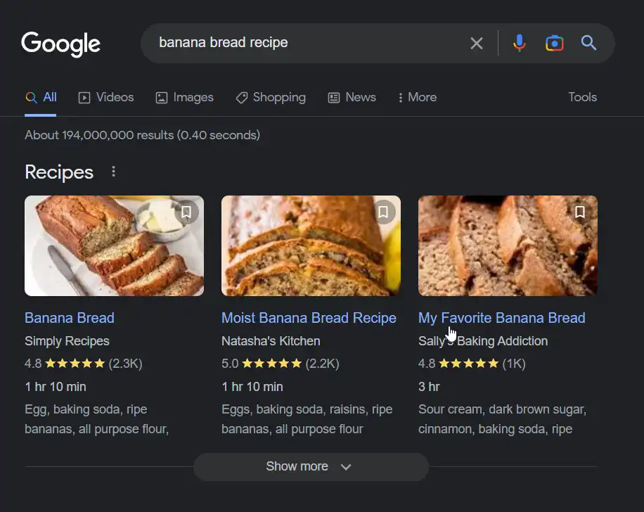
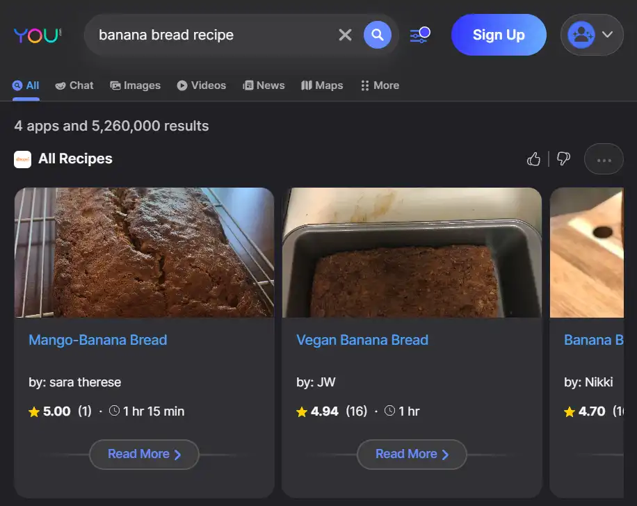
However, the You.com apps have additional features, including:
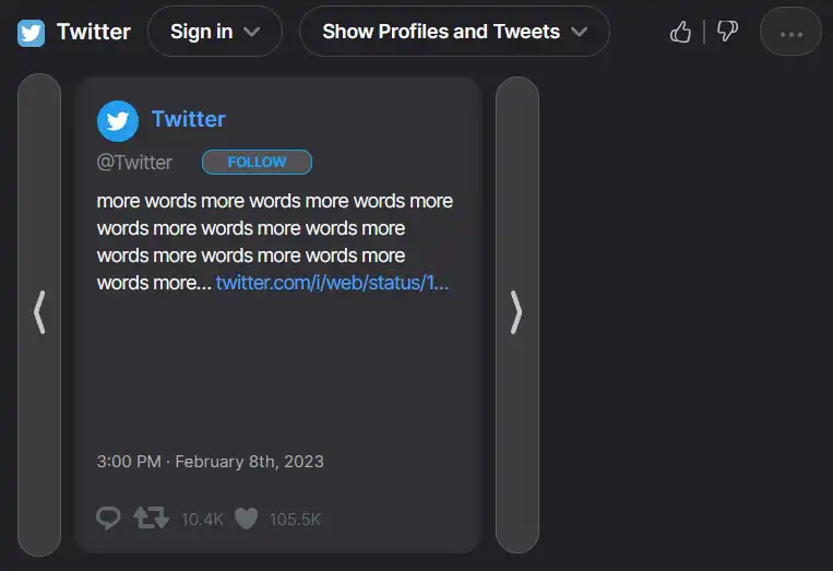
Website interactions from within the search feed
For some sites, you'll be able to view the most relevant content from the page within the search feed. Moreover, you can interact with the site from the app. For example, if you sign in to the Twitter app, you can follow, retweet, or favorite a tweet without leaving the search results page.
Apps aren't just for websites, though. There's also:
AI widgets
AI interactions are available within the search feed, with features like code generation (YouCode), text generation (YouWrite), and an AI chatbot (YouChat).
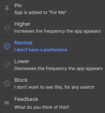
The ability to vote and pin
It's possible to express preferences for the apps you'd like to see through upvotes, downvotes, pinning, or blocking. These preferences will personalize the search results that populate your feed. However, pinned apps aren't always at the very top of the results.
Apps won't show up if they're not relevant to your search. Thankfully, my "banana bread recipe" query didn't include results from Stack Overflow.
Apps from a user perspective
A caveat for this section
This isn't a criticism of the You.com product team. I'm not privy to all of the factors that affect business and product strategy decisions. However, all product features have pros and cons, and it's useful to consider what those might be as a thought experiment.
Keeping in mind that the target audience for You.com is software developers, a few pros and cons for apps come to mind.
Pros for users
- Speed: It's faster to find information and access site features without having to actually click into the website.
- Reduced context switching: Workflow friction is lowered by combining complementary features into one feed.
- Saved search preferences: By pinning useful apps, users know their favorite sites will show up in the feed without effort.
Cons for users
- Complexity: Streamlined tools like Author have found popularity because of the way they reduce mental overhead. The You.com search engine is a different kind of tool, but some might not enjoy the way features are visually integrated.
- Apps have different functions: As noted above, each item in an app listing could include an interaction, an AI widget, or simply be a link. Users could end up with a muddled mental model of what exactly apps are.
- Potential inaccuracy of AI-based apps: There are many examples of AI chatbots giving out erroneous information, which erodes trust in the product.
You.com apps from a product perspective
Let's examine the pros and cons of the app features from the perspective of product strategy as well.
Pros for the product
- Centrality: A lot of functionality is included, increasing the likelihood that a user will stay on the site longer.
- Appealing to target audience: When the Stack Overflow and YouCode apps are visibly embedded within search results, it's easy to see their utility.
- Fresh and exciting: It's been some time since search engines have seen true innovation, and apps feel like a preview of what's coming.
- Leaves the door open to add more functionality: Apps are currently based around websites or AI tools, but it's easy to envision more kinds of tools entering this space (something like a Todoist widget comes to mind).
Cons for the product
- Lots of development work required: Since the You.com team is creating most of the apps (so far), it has to be a lot of work to create and maintain apps for so many websites, web applications, and AI-tools.
- Lack of incentive for sites to develop their own apps: By keeping the user in one central location, websites could take a hit in page views. Without additional incentives, I think they're unlikely to put effort into something that could harm their own business model.
- Inertia: One consequence of novelty is that people may be inclined to stick with something they better know and understand.
Conclusion
I've used You.com and its apps for help with coding, and I've found it to have utility for the use case of quickly finding answers to questions and generating snippets of code that clarify concepts.
The search engine is a staple of the internet, and changes to them have far-reaching implications. It's a risk for a product's value proposition to rely on novel forms of technology. While there's much debate about the role that AI will play in shaping the next generation of technology, there's no doubt we'll be hearing about it for a long time to come.
Category personalization
The Walmart website (and app) recently added a small touch of personalization. The site has a section to reorder items that you've previously purchased ("My Items"). The section header includes a horizontal scroll of grocery categories: Fresh Produce, Pantry, Meat & Seafood, and so on.
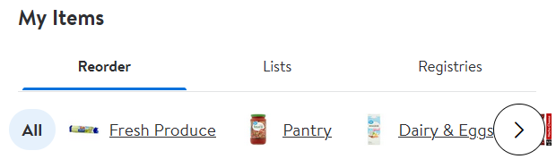
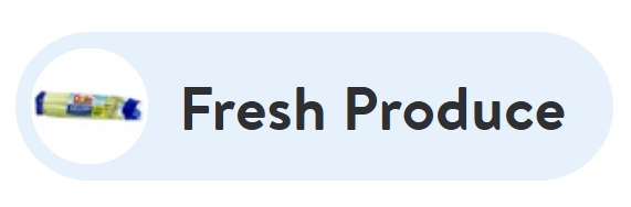
An image is associated with each category name. The interesting part is that each image matches an item the customer has actually purchased before.
What purpose could a customized product label serve?
I'm conjecturing, but I would imagine the personalized image is there to make it easier and faster for users to find products. A customer will spend more money on items they're actually able to find. It may reduce the time it takes make a purchase, resulting in a more efficient shopping experience.
Pros and cons
What are the advantages of this feature? First, the user's memory is activated. Compared to a generic icon, an item you already know and love could create a stronger association to the category. Additionally, the image is a reminder of something you may want to buy during your current session.
From my perspective, the primary disadvantage of the feature is the tiny image size - it's only 30 x 30 pixels. The small size is necessary to keep the image proportionate to the text and maximize the limited horizontal space. However, for anyone with limited vision, the image could very well appear as a blur. As someone without vision issues, it's already quite difficult to see.
This is a fairly trivial example, but it does point to some novel uses of personalization. It makes me wonder how product labels, descriptions, and images could be customized as well. It'll be interesting to see how personalization is further incorporated into products.
Comparing B2B sales funnels and digital product adoption
As much as I enjoy building interfaces, I often take a step back to examine user journeys. When evaluating a product at a broad level, it’s possible to map potential features to user pain points and identify what truly brings the most value to customers.
If teams neglect the broader perspective, they risk stifling innovation and releasing a product that only offers marginal improvements over the competition.
While I’m not the first person to understand this, I did want to set up the context for this article, written by UX veteran Paul Boag (the “weird uncle of web design”). By comparing product adoption to a B2B sales funnel, Boag argues that UX designers should have the opportunity to assess experiences from a holistic perspective to ensure that digital and person-to-person touchpoints feel integrated. In both a sales funnel and a digital product, any gaps can negatively impact conversions and user satisfaction.
Onboarding learnings
This week, I've been thinking about onboarding as part of a case study I'm working on. I've found some helpful resources, and I wanted to share a few takeaways:
- Onboarding is important from a design perspective, but it's crucial from a business perspective. Generally, user retention falls dramatically after a couple of uses. Products need to quickly demonstrate value to bring potential customers to the next step of the acquisition funnel.
- First-use onboarding flows often seem like a good idea, and they're quite common. However, they come with significant downsides. There's a high cognitive cost to remembering everything in a flow. A large number of users will likely flip through it without reading too closely, anyway. Where does onboarding go, then? Onboarding concepts can be injected into empty states, revealed while a user is working on a key task, or added to (brief) in-product walkthroughs.
- The ideal situation is to be conducting research and collecting data about onboarding on a regular basis. Still, even a single question survey can be effective at grasping sentiment at a key point of a task.
Onboarding is a small part of a product's design, but it's worth the effort to improve upon it.
Here are some of the resources that have helped me learn about onboarding:
- User Onboard's Onboarding UX Patterns
- Best Practices for Onboarding by Nick Babich
- Mobile-App Onboarding: An Analysis of Components and Techniques by Alita Joyce
- Onboarding UX: How to Research and Design a Great First Impression with Pulkit Agrawal of Chameleon on Awkward Silences
Ideas from platform design & content strategy
I stumbled across Elizabeth McGuane's talk, Platform Design and Content Strategy, early on in my exploration of UX. A couple of topics stuck with me:
- The framing of mental models vs. concept models:
- Mental models: how users think about a product
- Concept models: how product teams frame the product to shape users' mental models
The term mental model is often used to describe both ideas, but it can be useful to acknowledge the inherent gap between how products are crafted and how they're perceived.
- Concept models lose value when they're not updated with new findings about users and the company itself. However, change adds a mental burden to both teams and users, so change and consistency must be balanced.
For me, the talk cemented the value of understanding how people think and speak about products. This understanding makes products more useful and aligns teams around a clear value proposition.
Flexible product roadmaps
I appreciated learning about a different take on product roadmaps on a recent episode of Better Done Than Perfect. ProdPad, a tool for PMs, incorporates a flexible approach to roadmaps (Now/Next/Later). It allows time for discovery and the inevitable speedbumps that occur in feature development. I'm curious to know if it has helped teams reduce design and technical debt as well.
Some things will almost always have firm deadlines, but this method of project planning seems straightforward and realistic.
Research and monetization
John Kotowski recently spoke on Better Done Than Perfect regarding his approach to helping SaaS companies optimize their monetization models. It's notable that research is his first step in his process. Research can not only make a better product, but also better monetize the product. The research target isn't exactly the same as UX research - users vs. buyers - but in both cases if you're not starting from place of knowledge, you're starting from a place of weakness.
Antipersonas
An antipersona is an artifact to viscerally think about product misuse and manipulation. Security is often considered from a code perspective, but it's an important concern for designers as well, especially as technology permeates our lives even more deeply. It's essentially another form of risk management to protect businesses and the people who use their products.
Content strategy, graphs, and AI
I've dabbled with graph queries when building websites with Gatsby.js, but I hadn't previously thought about how graphs could be used in content management. On a recent episode of the Content Strategy Insights podcast, Ashleigh Faith talks about how utilizing data graphs and AI can yield insights that wouldn't otherwise be accessible, for both companies and users.
Revisiting usability test tasks
Mistakes to avoid in usability testing
Tools for service design
As someone who thrives when thinking on a big-picture, strategic level, I've found service design to be an interesting area of the UX/CX landscape. The Service Design Tools site collects artifacts and activities that encourage ideation on how experts, stakeholders, service staff, and users connect in broad processes. There are a few tools I haven't come across before:
Ecosystem loops: A map for thinking about stakeholders and parties that are connected to a system in a way that's not readily apparent
Future backcasting: Selecting a future scenario - positive or negative - and working backwards to figure out the factors that would lead to the future state
Behavior change wheel: Considering how design can diminish barriers to a desired behavioral change
Impact journeys: Analyzing how a service process could affect large-scale aspects of the world, like the environment and social dynamics
By taking a step back from day-to-day work and noticing the big picture, it's possible to be more strategic and reduce the risk that current decisions will lead to an unintended outcome.
Passkeys and authentication
I've come across websites and apps with passkeys (passwordless logins) a few times. However, until yesterday I didn't realize there was an organization (FIDO Alliance) committed to standardizing them. With many of the largest tech companies involved and the technology in place in most browsers, we're already in the midst of a giant shift around authentication. The organization provides UX recommendations for implementing passkeys.
Wireflows
Wireflows combine wireframes and user flows to document how interactions trigger changes in content and layout over the course of a user task. This is particularly helpful for web and mobile apps, where single screens may have a range of dynamic content. It's an interesting example of customizing a deliverable to fit a specific use case, and a good reminder that deliverables aren't the end goal, but tools to communicate and reach a specific design outcome.
Typeface and reading speed
Jakob Nielsen reviewed Adobe's study of how typeface choice affects reading speed. The takeaway: we're not that close to parsing out all of the potential factors in font legibility, which likely include age, reading level, and context. After reading this, I have some questions about how typefaces can impact user and business value.
- Do users get more value from reading a typeface they enjoy versus one that helps them read the fastest?
- Is it more valuable to use a typeface that helps users remember a site's content or one that reinforces a unique brand identity?
Like most design decisions, it essentially comes down to trade-offs.
Design patents
I hadn't been introduced to the idea of interface design patents until I ran across From Like Buttons to Message Bubbles: The UX Designs You Can’t Use by Christie Tang a few months back. While many patents are for specific elements in certain contexts, some are surprisingly generic. They're so inexpensive that some large companies are buying them up by the thousands.
Patents are public, and while many of them will never be used, viewing them can offer a glimpse into the kinds of features key players in tech are considering for future release.
2022 CSS feature upgrades
If you design for the browser, it's worth paying attention to the recent and soon-to-be-released CSS feature upgrades. Container queries allow elements to change size based on the size of the HTML element that contains it, as opposed to the size of the browser window. The :has() selector can change the styling of an element if it contains a specified child element. For example, a card could be styled to have extra padding only if it includes an image. Once these new features are supported in all browsers, it will be much easier to design elements that currently require complex logic. For example, Dave Rupert posted about styling grids differently when they have an odd or even number of items.
I originally found this article in both Alex Trost's Frontend Horse newsletter and Chris Coyier's Codepen newsletter.
The pitfalls of voice and tone guidelines
The last episode of Content Rookie was a noteworthy, unfiltered perspective on the difficulties in implementing tone and voice guidelines. These guidelines are very popular within UX writing at the moment, but the document may or may not have an actual audience. There's also the question of who will ensure that website and application copy follows the guidelines. It's a good reminder that design system artifacts aren't useful if they're not actually being used.
UX as an independent study
My approach to building skill in UX methods
Career Q & A
How my career experiences relate to UX